Mobilegeddon? No problem with Responsive Bartik on Drupal 7.x
In the last week there were a lot of articles about the new mobile-friendly ranking algorithm introduced on 21 April by Google, followed by an incredible hysteria about this topic, known as Mobilegeddon. I don’t understand where is the problem: a responsive website is the best compromise because adapts itself according to the display size and today is easily to reach (many site have solved it since a long while). I want to show you my experience with a video comparison between the original theme and the responsive one on my Drupal 7.x site and some suggestions.
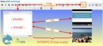
I have read an amount of Italian posts and the relative comments and I have been anxious about it. So I have recovered the old Google Ad-Sense email from the recycle-bin and reading it I discovered that 11% of the traffic to my site has been coming from mobile users, so my anxiety was increased a lot! Scared by that (will I lose this users if my site is unfriendly to them?), I immediately did the mobile friendly test and this is the result for my website:

The analysis phase

The verdict


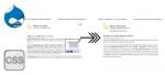
Joking apart, I have been using a dynamic layout from two years and I think that nowadays a responsive site is a perfect solution for covering almost the whole display size options, from the smartphone to the tablet e from the notebook to the big monitor. In the past, web designers were forced to identify a restricted range of display sizes and draw the layout only for them, but nowadays with HTML5 and above all CSS3 there are less restrictions and it is more easy to create flexible schemas. Below there is the behaviour of my site depending on the display size[fn]I obtained these outputs using the Open Developer Tools in Google Chrome ("F12" key) and clicking the Turn on device mode button in the bottom menu (the second icon on the left), check Device Mode & Mobile Emulation page for more info.[/fn]:

That doesn't mean that responsive web design is a simple issue but makes websites readily available to a wider consumer base and if you use a popular content-management framework like Drupal, Wordpress or Joomla, probably you can try different responsive themes and consequently adapt them to your site. In a few words you must not reinvent the wheel, because this would be neither efficient nor easy.
In my case I started with Bartik, a standard theme and in my opinion the easiest one to understand and change under Drupal 7. Then I discovered the Responsive Bartik D7 project and I moved to it. The structure is more or less the same and it had been more complicated starting with the first theme than migrating to the second.
Citing the project, it is derived from the D8 version and in addition it will also include the following features:
- HTML5 markup
- WAI-ARIA accessibility roles added to primary elements
- Html5shiv, Respond.js, Selectivizr.js for IE versions 7 & 8
- Menu Collapsible menu on small screen sizes
As you can view in the following screencast a coexistence between many display sizes is possible and the contents may be formatted conveniently without any loss.
If you want to understand more information about the topic I suggest this article: Responsive web design: Key tips and approaches, where the author describes the approaches used when designing for different devices, what screen sizes and resolutions should be taken into account, and how RWD works from a designer’s point of view.
From a layman’s point of view, I followed three approaches:
- An abuse of media queries: CSS allows for page styling (including hiding content) based on characteristics of the device the site is being displayed on. Page styling is most-commonly based on the width of the browser.
- The fluid grid: when page elements are sized in relative (%) units and the number of grid columns change depending on the width limits.
- Floating elements.


Add new comment